Impellam, a leading talent solution provider, owned a powerhouse portfolio of brands from STEM recruitment experts to MSP specialists. But for top-tier clients, it wanted to be seen as more than a collective. The ambition was to show up as a strategic partner, delivering the full force of its multi-specialist capabilities. Without a clear group presence, though, it risked becoming the silent partner in its own success.
Customers weren’t connecting the dots between sub-brands. Sales teams were stitching together assets and messaging on the fly. And internally, Impellam operated more as a functional holding company, than a distinct brand with clear customer-facing offers.
The ambition: to build a credible brand that was easier to buy into and belong to. Something that would work harder for customers and unify internal teams.
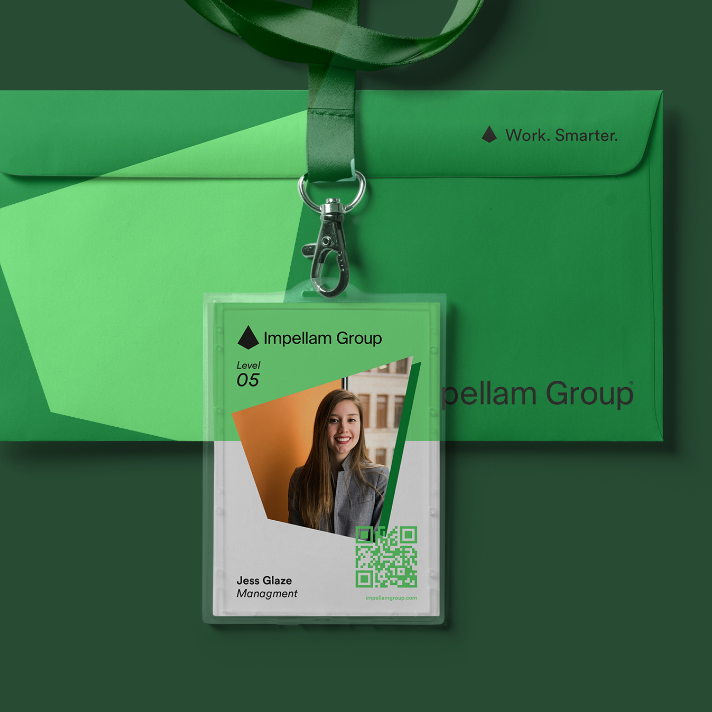
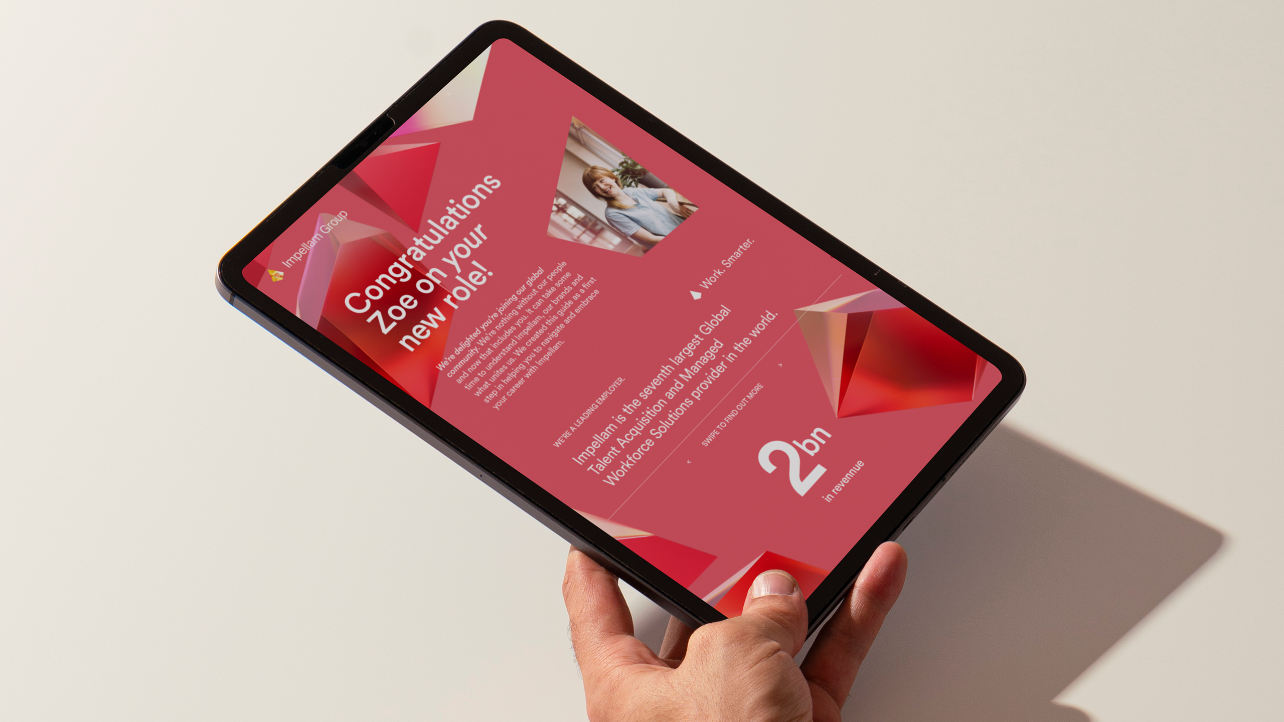
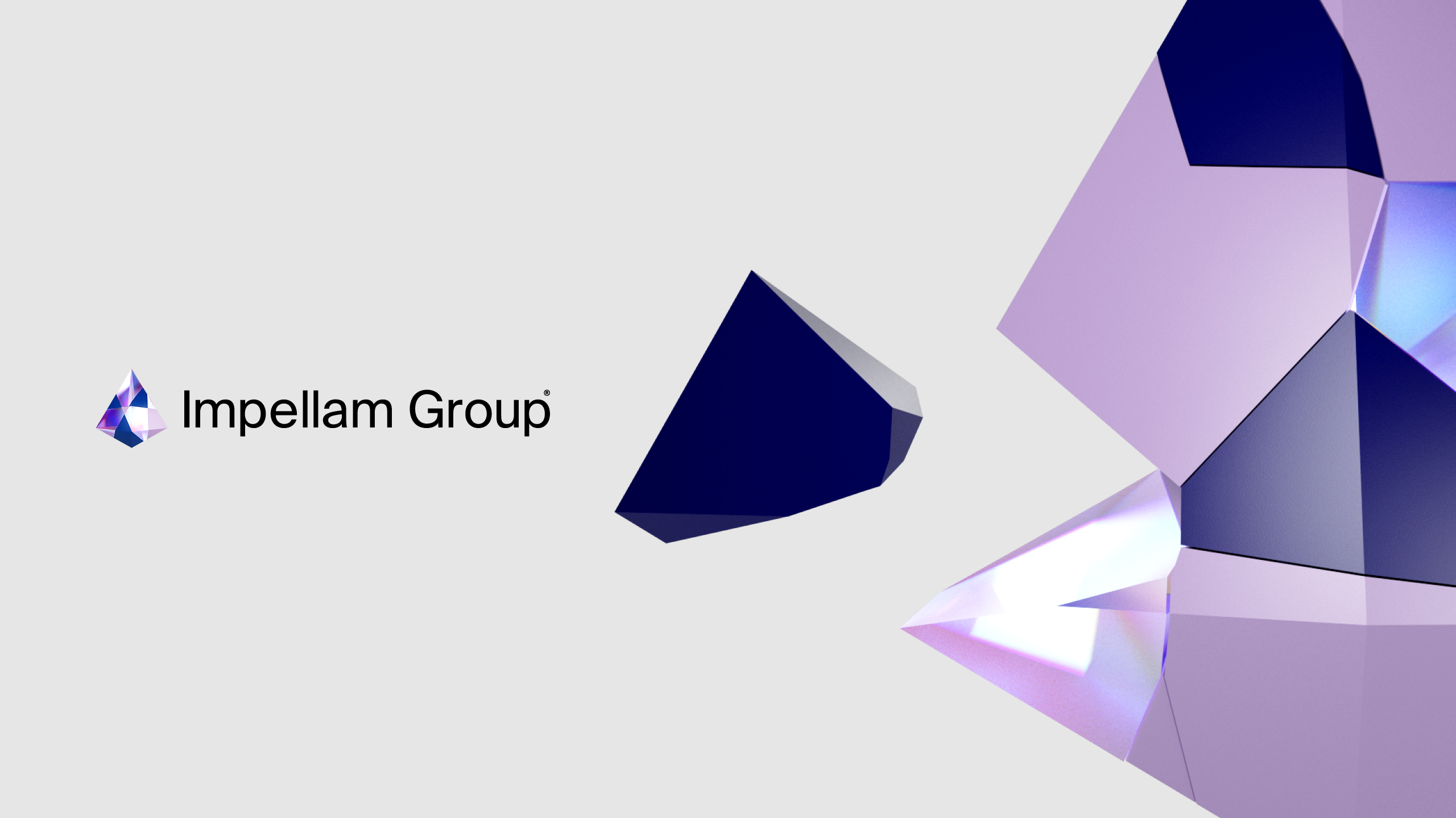
We created a bold, adaptable identity system that gave Impellam the presence it was missing. No longer a behind-the-scenes player, but a brand in its own right.
From refining the logo to building assets to an internal onboarding portal, we developed a visual language that gave clarity to Impellam’s collective offer and confidence to the teams delivering it.
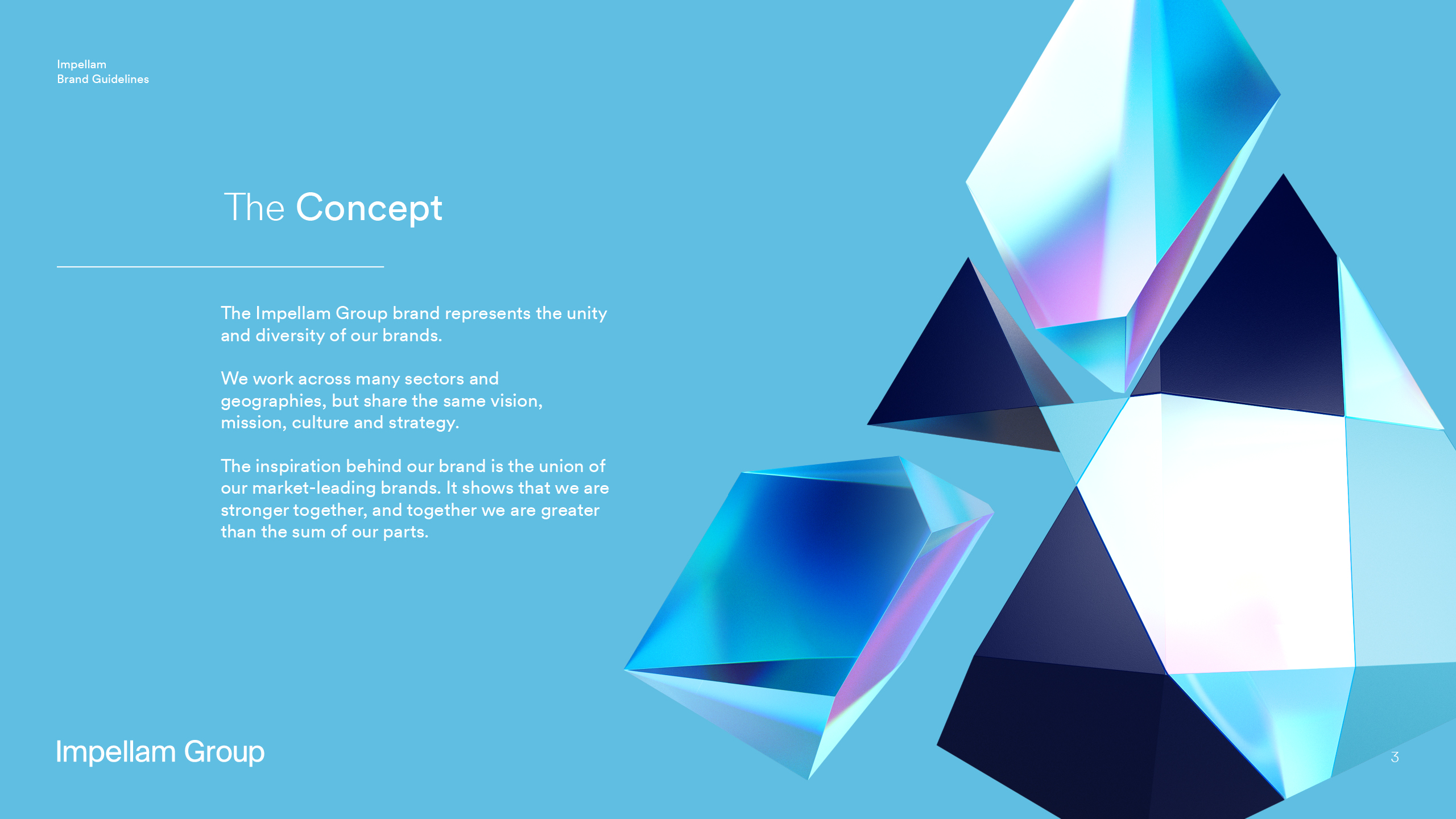
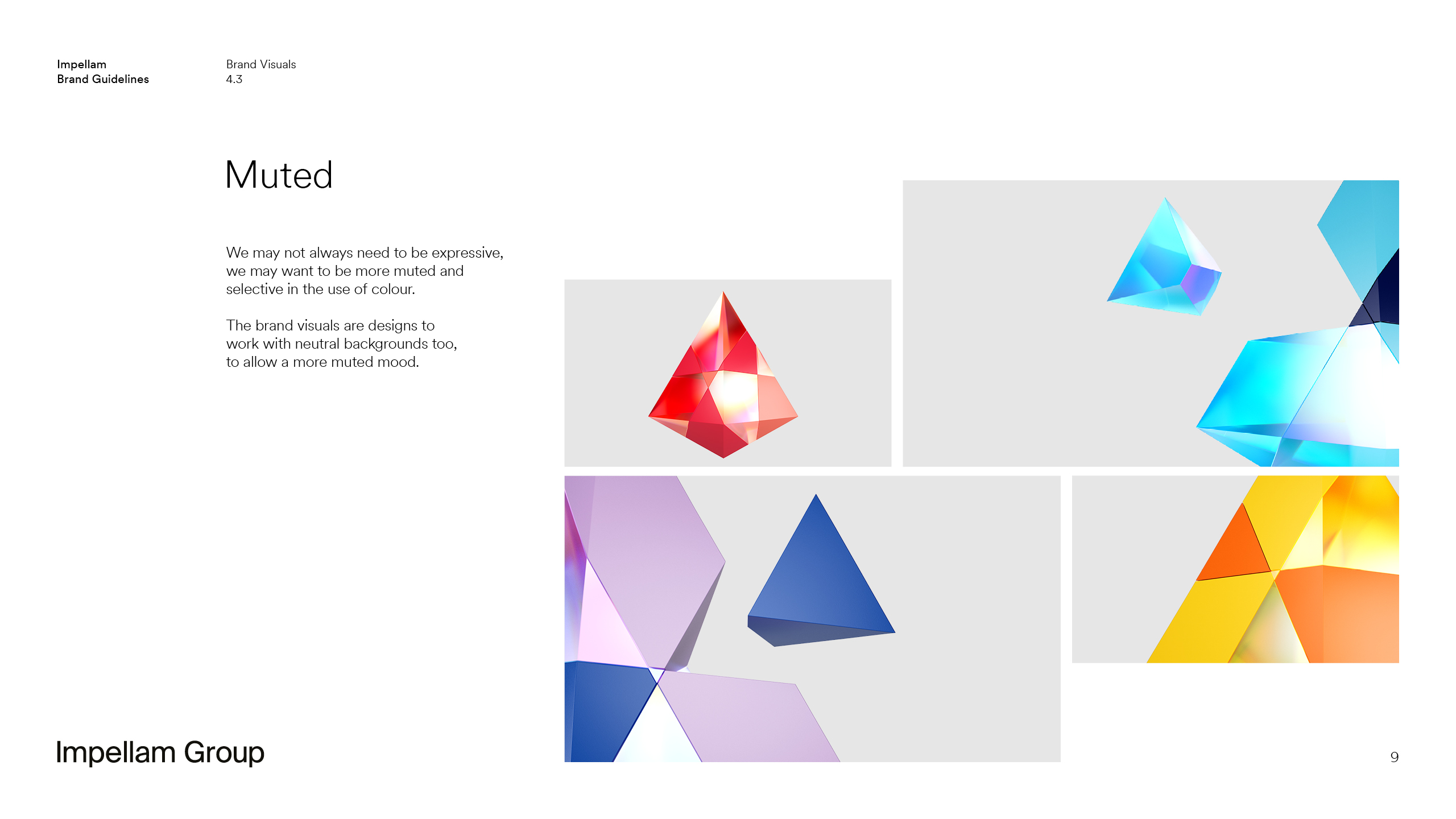
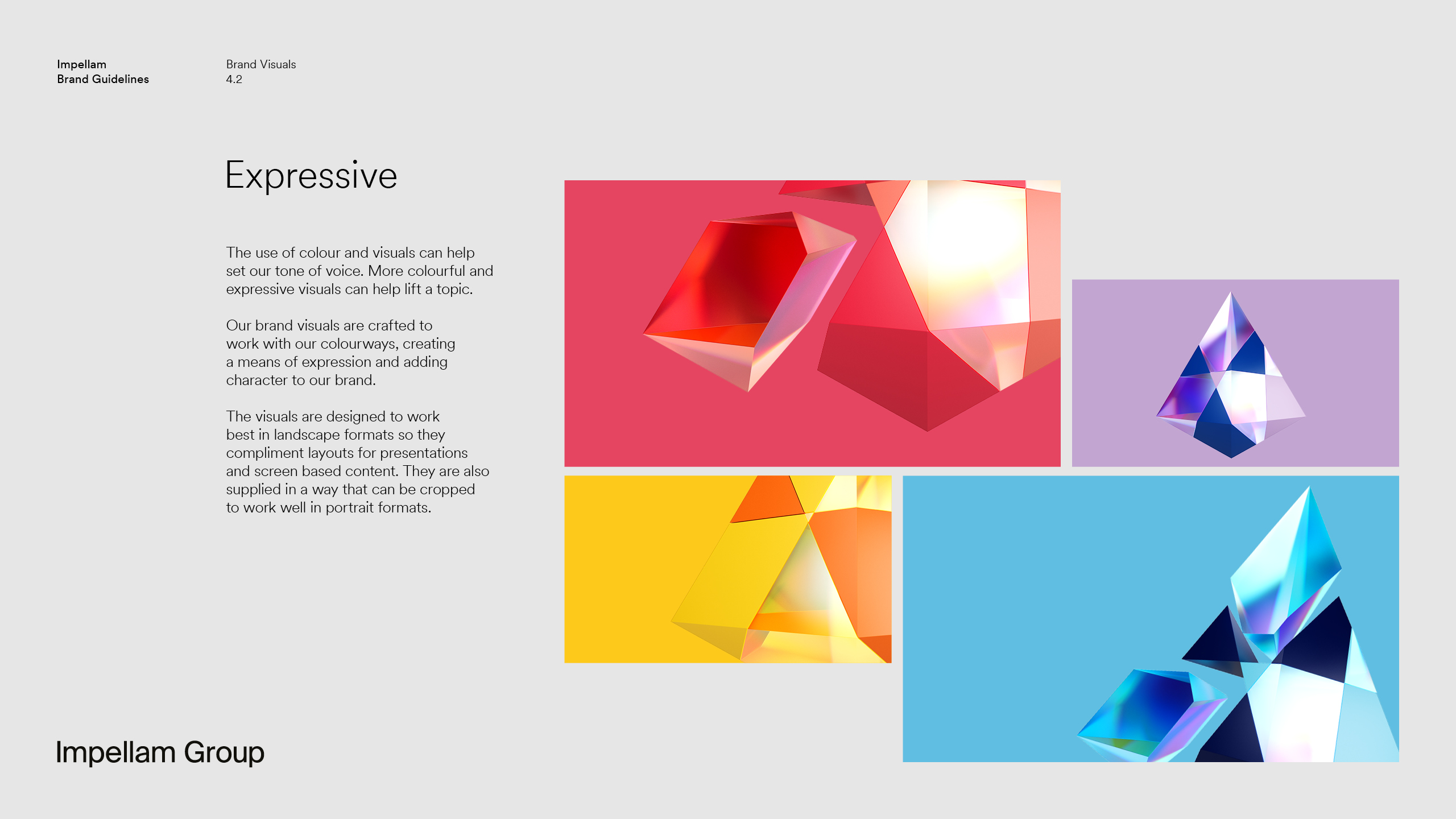
At the heart of the system was the crystal symbol, deconstructed into colourful graphic elements representing different brands, people, and ideas coming together to form something greater. The refined identity balances professionalism and personality, resonating with enterprise clients and internal teams alike and was rolled out across internal comms, onboarding tools, and external campaigns to create consistency at every level.